Organising visual language
According to Connie Malamed (2009:5), one needs to really understand the importance of visual language before you start designing. She says that a picture is more than just two-dimensional markings on a flat surface. A picture reflects the creator’s intent and it communicates information. It is the result of creative play and thoughtful decisions. It gives the viewer a visual experience. In other words, each picture has a purpose. Designers assume that viewers will understand their message. They believe that when the viewer looks at the colours, shapes and lines, a form of communication will take place. Designers also assume that the viewer will look at the picture in a set sequence (in other words, the viewer’s eye will travel to the most important parts first and to the least important parts last). The designer has control over this sequence.
So when you plan your design, you need to decide what you want the viewer to focus on first. What are the most important parts of the design? The viewer might have to read the headline first before the picture or the body copy would make sense.
To complicate the matter even further, certain cultures (and even age groups) see things in different ways. That means that you can’t simply assume that everyone will see the image in the same way you do. As a designer, you will most probably have a better understanding of perception, because you work with visuals every day. Because of this, you will also understand the concept of visual language better. So what comes naturally to you might have to be spelled out to the viewer.
This does not mean that your viewer is unintelligent and should be treated that way. (You can’t add an instruction manual along with each design to explain the concept.) All it means is that you should use the tools of perception to your advantage. The viewer should be able to take in the message easily and comfortably.
Design is about the making of things: things that are memorable and have presence in the world of mind.
Krome Barratt
I think that this quote will inspire you, it is by Krome Barratt (excerpt from Logic & Design in Art, Science & Mathematics), “For design is about the making of things: things that are memorable and have presence in the world of mind. It demands us to merge information and knowledge, and to use it imaginatively to create purpose in the search for fresh information. This highlights the importance of being able to use information (from a client brief) and take it to new heights in your design. The message should be clearly understood and the viewer should feel enriched when taking in the information. In order to do this, each element of your design should have intent and purpose, never add something simply because you want to fill a space with visuals.
Fortunately, the human ability to perceive is naturally strong in most viewers. That means that designers don’t have to use intricate tools and complicated methods in order to express information easily. They should simply understand the underlying principles at work when visual language is being perceived. And then of course, as with all forms of creativity, designers should also make their own observations. This will help them to think logically, use the design fundamentals wisely and gain an individual understanding of the process.
As stated in the book "Visual Language for Designers: Principles for Creating Graphics that People Understand", our eyes are remarkably alert and responsive. It helps us perform tasks that are necessary for survival in our environment. At the same time we can use our sight to see and understand pictures. For example, without even thinking about it, we constantly scan our surroundings to extract information about what is “out there”. If there is anything important or unusual, we notice it.
Similarly, without even thinking about it, we scan a picture or design to gain information. We immediately notice if there is anything important or interesting. All of this happens effortlessly, before we have consciously focused our attention.
So how does one communicate using a visual language? How do you know where to place all the different elements? Let's take a look at the most important mechanics of perception and how the designer can use these to make perception easier for viewers:
If the viewer’s eyes are permitted to wander at will through a work, then the artist has lost control.
Jack Frederick Meyers
The first rule of thumb is to direct the eyes of the viewer. The importance of this becomes clear when reading this quote by Jack Frederick Meyers (excerpt from The Language of Visual Art), “If the viewer’s eyes are permitted to wander at will through a work, then the artist has lost control.”
The designer needs to decide what the order of perception will be. This means that the designer has to decide what the viewer will see first, and what the viewer will see last. Which parts of the design should be emphasised and which parts are relevant, but not crucial.
So how does one do this? How do you direct someone else’s eyes? We will now look at the fundamentals of visual language. These fundamentals are useful tools that will help you achieve a good visual balance. Apart from using these fundamentals, it is also important to make your own observations. Page through a magazine; what draws your attention? What colours and layouts do you notice first? If possible, get feedback from the people who view your designs. Did they react in the way you intended?
The fundamentals of visual language
Position
The boundaries that form the edges of a graphic, also known as the frame, have a powerful effect on a composition. Whether it is a postcard, a page, a poster or a screen, the frame creates meaning for the elements inside it. It is generally accepted that the position of an object within a frame creates a certain tension. This tension affects the perceived importance of an object and thus where we place our attention. Think of a normal A4 page with a big splat of colour near the edge of the page. Now imagine the same splat of colour right in the centre of the page. Which would be more comfortable to focus on?
If you think carefully about where you place each element, you can create a visual hierarchy to direct the viewer’s eyes. The position of each element conveys its importance. Start with the most important element and work your way down to the least important element. For example, in a magazine spread the information graphic might be the most dominant element, followed by a headline and then body copy. A standard visual hierarchy consists of three levels—primary, secondary, and equivalent.
Our understanding of positioning in a frame is a metaphor for how we view hierarchies in the world. We speak of people who have important positions as being at the top. Likewise, we expect the same in pictures. We anticipate that elements at the top of a page will be the most important.
In fact, research shows that objects in the top half of a picture are considered to be more active, dynamic and potent. In other words, they have more visual weight. Another study found that viewers spend more time viewing the left upper half of the page than the right lower half. This appeared to be true in both symmetrical designs and in a double-page spread. There’s one thing we can be sure of: changing the position of an object in a frame changes its impact on the viewer.
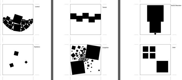
Take a look at the following layouts. What do you think of the positioning of the different elements? Which carries more weight? Which looks more important?

Source: aliciaiott.wordpress.com/gestalt-composition/
Also view the following image and consider if you agree with the descriptions given below.

Left top: Comfort
Left bottom: Playfulness
Middle top: Tension
Middle bottom:
Congestion,
Right top: Tension alternative
Right bottom:
Order
Emphasis
Creating energy and life in a design is achieved by variation and emphasis. Making everything of the same importance or strength will weaken the design or become so monotonous that the viewer loses interest. An important aspect of captivating design is the balance between elements in a composition – the strategic use of emphasis and balance. Take a look at the following examples. Which parts of the pictures are emphasised or highlighted? How do your eyes follow the composition? When you focus on the path your eyes follow, think of the impact of: bold and softened areas; textured and smooth areas; colourful and dull areas.

Source: totallydublin.ie

Source: app-promo.com

Source: creatiwittyblog.com

Source: 02varvara.wordpress.com
Movement
When a design has a dynamic sense of movement, our eyes seem to glide across its surface. Movement can be explained as an energetic force or tension between the lines, textures, shapes and forms of a graphic. Movement is more than just the repetition of patterns. It sweeps the viewer’s attention through a picture. It is a powerful way for graphic designers to direct the viewer’s eye to the important elements in a graphic.
Consider your design and how you would like the viewer's eyes to move through this. Do you want the viewer to move across and off of your page or do you want the viewer to return his or her eyes back onto the composition?
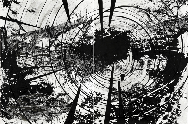
Look at this artwork by Yehudit Sasportas. What kind of movement takes place in this composition?

Source: www.sommergallery.com
Guidelines on logo design and Adobe Illustrator
Watch this Lynda video on illustration design:
When watching the film, also think about what you’ve learnt in Week 1 of this course. Think about the creative process and what new insight you can get from Von Glitschka's approach. Also observe the use of positioning, emphasis and movement. Does he use this intuitively? Where in the video do you see examples of these? Then go on to your Learning Activity - Illustration, Infographic and Brochure.