Making Your Designs Print Ready
There is a very informative tutorial online that shows you how to prepare files for print. For easy reference, I’ve included the steps below. I’ve also added some extra info and examples that will help you to understand the process better.
Why do we have to make files print ready?
When we make files print ready, we prepare them for press. In other words, by preparing our designs for print, we can ensure that we get the desired end product. If you don’t follow the steps, the prints can turn out to be a complete mess – an expensive mistake, especially if your client keeps you responsible for the costs.
How do you prepare files for print?
Let’s look at a few basic ways to prepare files for print. The examples used are for InDesign, but can also be used in Photoshop and Illustrator. First we’ll discuss a few important terms.
Read your briefing form
The first step is to read your briefing form and make sure that everything looks right. A good briefing form includes all the specifications that you should follow. It should tell you whether the design is portrait or landscape; double-sided or single-sided; full CMYK, black and white or one-spot; it should also include the specific sizes of the element. Also check whether your design will be printed in a magazine or newspaper, the quality of paper can have an effect on your design choices. If you struggle to remember all the steps to making a file print ready, it is good to create a little checklist that you can attach to each briefing form.
CMYK Vs. RGB
Many of the colours you create on screen (in RGB) cannot be reproduced when you print your artwork (CMYK). So, it is always best to create your documents in CMYK from the very start – in this way you’ll have a much better idea of how your colours are going to print.
Also keep in mind that CMYK is used for printing and RGB is used for online media. So, if you’re designing an ad for the web, choose the RGB option. If you are designing an ad that will be printed in the newspaper, design it in CMYK.
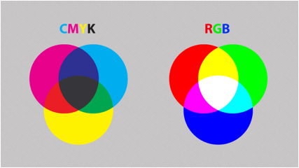
Image source: designinstruct.com
Four over Four (4/4)
Let’s say you’re printing a double-sided leaflet with full CMYK colours on the front and back, you are printing 4/4. If the back of the leaflet was left blank, it would be 4/0.
For business cards, you might print 4/1: so it will have full CMYK colour on the front and one spot colour on the back.
Or you might print the business cards 2/2, so it will have two spot colours on the front and two on the back.
Print layout
Before you send a design to print, you have to create a special print layout for it, which includes a live area, bleed area, trim lines and crop marks. Let’s take a look at each of these terms:
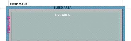
Image source: designinstruct.com
Trim line: This line shows the size that your design will be after it is trimmed. In other words, it is the final size of the finished product.
Live area: All the important information should be kept within this safe area. For example, if an ad’s trim size is 12 cm × 25 cm, the live area might be 11,5 cm × 24,5 cm. This is especially important if your ad will be placed on the far left or far right of a spread - you don’t want copy to become unreadable because it is too close to the spine.
Bleed area: It is very important that all printed designs should have a bleed area. This ensures that the viewer won’t notice if the design is not cut perfectly. The more bleed you can offer, the better. The minimum bleed you need for a printed piece is normally 3 mm, but some specs require more than that.
Tip: If you are working with an image in Photoshop and you’re placing it in InDesign for print preparation, keep the bleed area in mind before you copy the image over.
Crop marks: The crop marks show where the paper will be cut after the artwork has been printed.
Black and rich black
Did you know that when it comes to design and printing, there are quite a few different types of black you can choose from? The most important two types are known as “standard black” and “rich black”.
- Standard black (100 K) is perfect for printing body copy and barcodes.
- Rich black or packed black (40 C 40 M 40 Y 100 K) is better for printing solid blocks of black.
Note: Rich/Packed black specifications may differ from printer to printer, so it’s always a good idea to ask your printer what they recommend.
The difference between rich black and black
It may be hard to tell the difference between the two types of black when you see them on screen, but there is quite a difference in print. It is always a good idea to ask your printer for a proof if you have to print solid blocks of black. In this way you can make sure it looks right before spending a lot of money.
Below, you will see the difference between rich black and black:
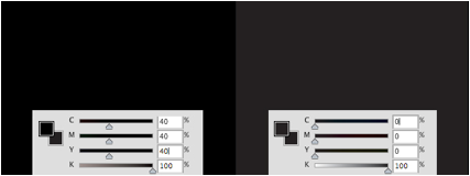
Image source: designinstruct.com
If you look at the example below, you will notice that black looks better than rich black when small fonts are printed. Do you see that the rich black “screams” a little around the edges?
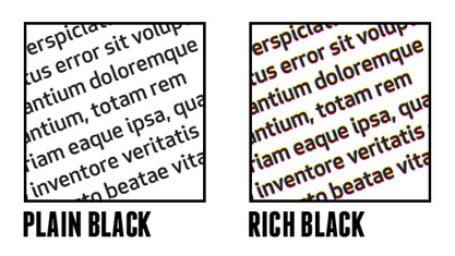
Image source: blog.progravix.com
Here is a sample of a flyer using the two blacks. (By the way, do you notice the trim lines, bleed area and crop marks?)
Image source: designinstruct.com
If you like to experiment a little, you can find and download the template here for the flyer above.
How to prepare a file with UV varnish/coating
The first step you need to take is to select the image or text that you want the varnish on.
Tip: It’s a good idea to create a layer and a spot colour named "varnish” or “spot" and then make sure that the spot colour you create is not already used in the file. This also ensures that your work is nice and organised. Below you’ll see a design without a UV varnish layer:
Image source: designinstruct.com
Then you need to open your swatch and panel and choose your spot colour.
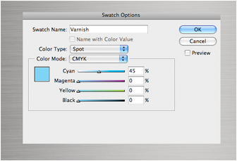
Image source: designinstruct.com
The next step is to select the pictures and text that you would like to apply the UV coating to.
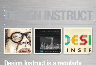
Image source: designinstruct.com
Add a new layer and copy the elements that you’ve selected. Then, on the new layer, apply the spot colour to the elements.
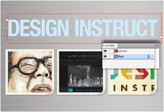
Image source: designinstruct.com
Extending design elements into the bleed area
If the type of your design needs to be directly against the trim, it’s good to rasterise the type and pull the paths out beyond the bleed. An example of this is the letter “D” on the design below.
(Here is a link that shows you how to rasterise artwork in Illustrator. This link shows you how to rasterise type in Photoshop and this link explains the difference between merging rasterising layers in Photoshop.)
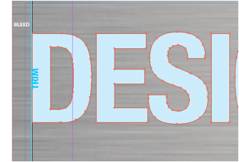
Image source: designinstruct.com
So we need to “pull” the letter "D" into the bleed area. In this way we can make sure that the letter is right at the edge when the final product is trimmed by the printer.
If we don’t extend it into the bleed area, there might be a gap between the “D” and the edge.
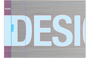
Image source: designinstruct.com
If you would like to practice this, you can Download the InDesign template for this design.
Using spot colour
When you work with a brand, you need to be sure that you match its exact colour (as stipulated by the brand identity). This is especially important when you are dealing with the company’s logo. In order to achieve this, you sometimes need an even more precise colour than what CMYK inks can produce. For this you would make use of spot colours or PMS colours. You can also use spot colours if you would like to make use of more vibrant options than what CMYK can offer.
Below you’ll see a flyer with two spot colours (2/2). The artwork was created in InDesign.
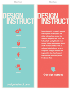
Image source: designinstruct.com
If you would like to play around a bit, you can download the InDesign template for this design.
The example below shows a business card that was printed using two spot colours. The business card was matt laminated and it has a spot UV varnish.
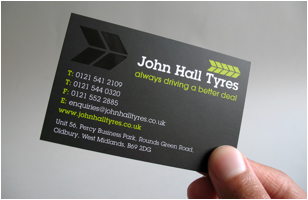
Image source: www.th3unknown.com
Tip: If you are creating spot colours in Photoshop, make sure that all objects and type that are in the same colour are merged on the same layer. Give the layer the same name as the spot colour. This will avoid confusion during the printing process.
It is also good to provide a layered PSD or TIFF file and rasterise your type and vector layers. You can do the same with files that were set up in Illustrator.
Last but not least, remove any unused colours before packaging the file.
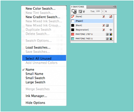
Image source: designinstruct.com
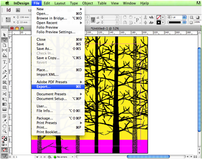
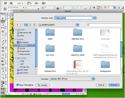
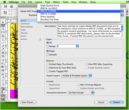
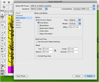
Generating a print-ready PDF from InDesign
Most Norwegian printers prefer a print-ready PDF with fonts and images embedded. Most printers can provide you with their own PDF-profile (job options). it’s always a good idea to ask your printer what they recommend.
OPTIONAL EXTRA - Print preparation
To make sure all files and links in your document are included and correct you can collect the files in InDesign. This is useful for keeping track of your projects and files, but the collected folder can also be sent to the printers if they are to make any changes. (Prepping photos, changing text etc.)
For further reading, please read the OPTIONAL EXTRA - Print preparation lesson.
Summary
You should now be able to prepare your design for traditional printing. If you follow the steps correctly, you should see good printing results. Even though we focused on InDesign, similar steps can be followed in other Adobe Creative Suite programs. Now all you have to do is practice!
Please download the following tutorial files:
- prepping_files_print/prepping files_pring_Flyer
- prepping files print/prepping files print uv coating
- prepping_files_print/prepping files print 2 spot color flyer
Paper stock and printing terms
Whether you want posters, flyers or business cards printed, at some stage your printer will ask you what weight of paper (GSM) you would like them to use.
What does GSM mean?
GSM stands for “grams per square metre”. It’s a measurement of paper quality that ensures that your printer knows exactly what you want. There are thousands of paper types out there, so vague terms like “thick”, “thin” or “medium” won’t get you very far. GSM tells you how much a square metre of the paper or card you are using would weigh in grams - the more the weight, the thicker the paper.
How does it work?
Even if you know the GSM of different types of paper, it won’t necessarily help you much if you are new to the design and printing industry. No need to worry, you’ll soon learn what works and what doesn’t. In the meantime, the following list will give you a good idea of the most common paper weights:
- 350 GSM – A thick paper, perfect for business cards of reasonable quality.
- 180 to 250 GSM – The weight of a mid-market magazine cover.
- 130 to 170 GSM – Used for good quality posters (something that you’d expect to last a couple of months in most conditions).
- 90 GSM – Mid-market magazine inner pages are usually this weight.
- 35 to 55 GSM – Most newspapers are made of this thin paper.
- Less than 35 GSM – Don’t go there!
Remember that printers are there to help you, so ask them for advice and suggestions. Also, ask them for a paper swatch book, in this way you’ll be able to look at different types and weights of paper, and most importantly, you’ll be able to FEEL the paper.
If you ever have the privilege of printing a book, remember that the cover and the pages on the inside have to work together (it might be odd if the cover is very thick and the inside is very thin and light). You don’t want the end product to be flimsy, but it also shouldn’t be difficult to hold or bend (especially if it’s a magazine that will be delivered by post). If you are working on something like an annual report, it’s fine to keep the cover and the inside pages at the same weight.
Tip: Choosing paper is almost like choosing fabric. It shouldn’t only look good; it should also feel good between your fingers. You can even ask your printer or paper merchant to make a mock-up, so you can get a good idea of what the final product will look and feel like.
Some useful paper terminology
- Bond (17" x 22"): writing paper (ink works well on it).
- Coated (25" x 38"): book paper with a smooth clay coating (available in dull, satin, gloss and matte).
- Text (25" x 38"): uncoated book paper (available in different colours).
- Offset (25" x 38"): uncoated book paper treated with sizing to resist moisture.
- Opaque (25" x 38"): uncoated book paper treated to be less see-through.
- Cover (20" x 26"): there are coated and uncoated versions - used for book covers, brochures, etc.
- Mill Bristol (22.5" x 28.5" and 22.5" x 35"): a board grade that can be folded, embossed and stamped.
- Index Bristol (25.5" x 30.5"): an affordable, stiff board grade. It has a harder surface than Mill Bristol.
- Tag (24" x 36"): a water resistant and foldable paper. It is often used for tags.
- Newsprint (24" x 36"): used for printing newspapers. This paper is highly acidic and degrades quickly.
- Digital: Perfect for copiers and printers (ink-jet and laser). It is also used in high-end digital presses like Xeikon and Indigo.
An extended glossary of printing terms
In your career as a graphic designer, you will be communicating with printers and printing consultants on a daily basis. You’ll soon get familiar with many different terms, but the world of printing can be a little daunting. The following list of terms will help you, so it’s good to print it out and keep it at your workstation:
https://www.printindustry.com/Glossary.aspx
(The glossary is originally from: Getting it Printed by Mark Beach.)
Norwegian printing standards may vary from this, make sure to do your own research.
Ask questions
The most important advice I can give you is to ASK QUESTIONS. If you are uncertain of what your printing consultant means, don’t be scared to ask. You might feel insecure and scared to ask “stupid” questions, but my motto is: Rather ask a “stupid” question than pay an expensive price or lose a client over a stupid mistake.